When browsing your favorite websites, have you ever paused to notice how a simple change in link color can transform the entire feel of a page? Link colors aren’t just about aesthetics; they play a crucial role in guiding users through your content and making navigation intuitive. In the vibrant world of WordPress, customizing link colors offers more than just eye candy—it’s an opportunity to reinforce your brand identity and enhance user experience. Whether you’re looking to create contrast for better visibility or simply want to match your site’s color palette, understanding how to manipulate these shades is key.
In this article, we’ll delve into the various methods available for changing link colors in WordPress—from basic settings within themes to more advanced techniques using custom CSS. No matter your level of expertise, adjusting these elements can breathe new life into your site and engage visitors like never before. Get ready to unlock the potential of your links and make every click count!
Why Change Link Colors?
Changing link colors is more than just an aesthetic choice; it’s a powerful tool for enhancing user experience and guiding navigation. When links stand out with distinct colors, they capture attention and direct visitors to key areas of your site, improving overall engagement. Subtle shifts in color can also communicate different states—like hover effects—that inform users about actionable items without overwhelming their visual senses.
Furthermore, customizing link colors can reinforce your brand identity. Unique color schemes not only embody your brand’s personality but also create a cohesive look that resonates with your audience. A thoughtfully chosen palette aligns with psychological principles of color theory, which suggests that different hues evoke specific emotions and reactions. By strategically altering link colors to match the sentiment you want to convey, you turn ordinary hyperlinks into an extension of your branding strategy—inviting exploration while ensuring clarity in navigation.

Identifying Current Link Color Settings
To effectively change link colors in your WordPress site, the first step is identifying your current link color settings. This can be done through the Customizer or the theme’s CSS files, allowing you to see how links are styled across different states—such as normal, hover, and visited. By inspecting these elements using browser developer tools, you can gain insights into inherited styles and pinpoint any conflicts with plugins or other customizations that may obscure your adjustments.
Understanding the types of links on your site—whether they’re text within posts, menu items, or buttons—can further refine your approach. Each of these elements might have its own set of rules defined by CSS classes or IDs. Pay attention to specific factors like contrast and readability; tweaking link colors against different backgrounds isn’t just about aesthetics but also user experience. Ultimately, recognizing where and how link colors are applied will empower you to create a cohesive look that not only enhances visual appeal but improves navigability throughout your WordPress site.
Using the Customizer for Link Colors
Utilizing the WordPress Customizer for link colors not only enables a seamless aesthetic alignment with your brand, but it also enhances user experience. A well-chosen color palette can draw attention to hyperlinks, guiding visitors intuitively through your content. For instance, opting for a contrasting color that stands out against your background ensures that links are easily distinguishable and accessible to all users—including those with visual impairments.
Moreover, the live preview functionality of the Customizer allows you to experiment without any pressure. You can test various hues and shades in real-time, facilitating an organic design process where creativity flows unhindered. As you adjust colors, consider how they resonate with your overall theme—colors like blue or orange can convey different messages and emotions depending on their use. This nuanced approach fosters deeper engagement from your audience while encapsulating the essence of your brand identity.

Changing Link Colors with CSS
Changing link colors with CSS is not just a tactical adjustment; it’s an opportunity to enhance user experience and brand identity. By smartly utilizing CSS properties such as `color`, `hover`, and `active`, you can guide your users through your website with visual cues that resonate with their expectations. For instance, using a contrasting color for visited links can help users navigate more effectively by indicating where they’ve been, making your site feel intuitive and tailored.
Moreover, experimenting with subtle animations or transitions when changing link colors can add an engaging touch to your design. A smooth color shift on hover can intrigue visitors—drawing them into interaction instead of passively scrolling past content. Remember that it’s not only about aesthetics; accessibility plays a critical role too. Ensure that the color combinations you choose are easy to distinguish for all users, including those with visual impairments. This thoughtful approach in changing link colors ultimately creates a more inclusive web environment, encouraging exploration while reinforcing brand consistency across the site.
Plugins for Easy Color Adjustments
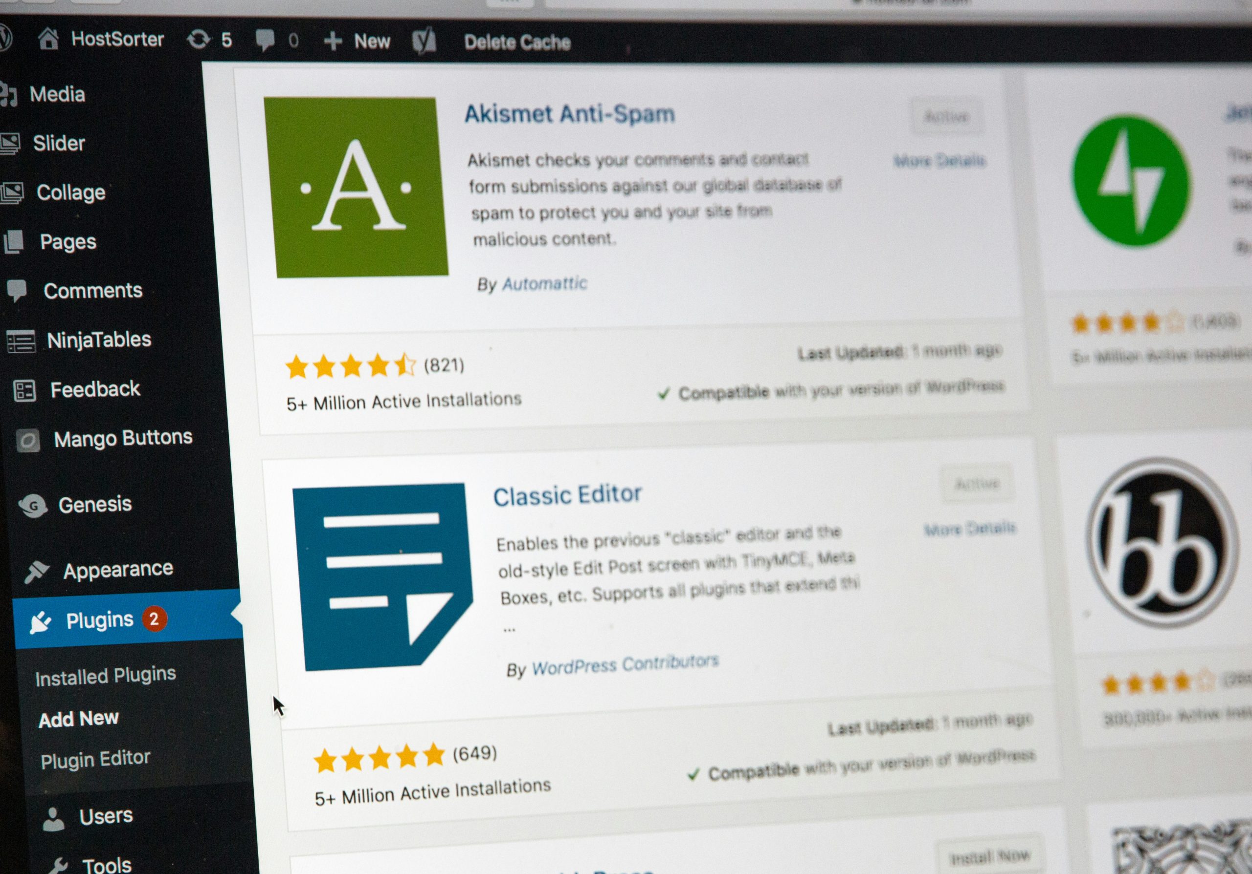
In the ever-evolving landscape of web design, color plays a pivotal role in user experience and engagement. Utilizing plugins for easy color adjustments can simplify the process of customizing link colors in WordPress. Tools like “Advanced Editor Tools” or “WP Color Picker” offer intuitive interfaces that allow you to experiment with various hues without delving into complex CSS codes. These plugins not only provide hex value inputs but often come equipped with color palettes and gradient options, enabling even non-technical users to create visually striking links that resonate with their brand identity.
Moreover, leveraging such plugins enhances consistency across your site’s appearance. As you adjust your link colors, many options allow real-time previews, ensuring your chosen palette complements existing elements seamlessly. Compatibility with page builders further amplifies their practicality; imagine adjusting the link style within Elementor or Beaver Builder while maintaining cohesive aesthetics throughout! By focusing on accessibility features—like ensuring sufficient contrast between text and background colors—these tools also promote inclusivity for all users, ultimately enriching the browsing experience on your site.

Conclusion: Enhance Your WordPress Design
Enhancing your WordPress design goes beyond merely changing link colors; it’s about creating a cohesive user experience that speaks to your brand’s identity. By carefully selecting colors that align with your overall aesthetic, you not only improve navigation but also reinforce emotional connections with your audience. Remember, the right hues can evoke specific feelings—warm tones may inspire enthusiasm while cooler shades often instill trust and calmness.
Moreover, consider integrating other design elements such as typography and imagery. A harmonious combination of colors, fonts, and visuals can make links more appealing and guide users naturally through your content. Experimenting with hover effects or transitions can add a dynamic touch that lingers in visitors’ minds long after they leave. Ultimately, enhancing your site’s design is about creating an engaging landscape where every detail—from color choices to interactive elements—reinforces the message you want to convey and invites exploration.

